Monday, 29 November 2010
Monday, 22 November 2010
Collection of first year work
Below are some of the work that I will include on my website. I will change the size of all these pieces of work so that they fit my designated space on my website.
Adding work to my website
Below I show that I have tried adding images to my website.
I have re-sized them using the notes I took during the tutorial which are shown in the previous blog post.
I have only placed them on the homepage background to show that I have changed the size of the images to make them an appropriate size. I had to change the resolution to 72 dpi and change the height to 370 pt.
Saving first year work for my website
Notes taken during tutorial
- Begin by copying documents into a separate folder so that do not overwrite document.
- Photoshop
- Open up document
- Select image- then image size- need to then change the resolution to 72 dpi, then change the height so that it fits the designated space on my website
- To save document need to select file- save as- then save it as a jpeg at maximum quality.
- All documents should be viewed at 100% so that know the document isn't too large.
- Illustrator
- Open up document
- Select file- export- need to save the document as a jpeg at maximum quality.
- To make this document the correct size- must open up in photoshop and do all of the above.
Monday, 15 November 2010
Another homepage design
Monday, 8 November 2010
Progression of Website layout
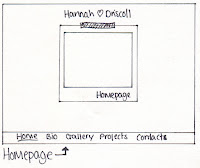
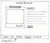
Below I have added my drawings of how I want the different pages to look. These are only in black and white at the moment so my next step will be deciding on the colour and then working them up onto the macs. I will need to get an image of a Polaroid photo as my website is based on this. I will also scan in various sizes of masking tape so that I can experiment with what looks best.

Monday, 1 November 2010
First attempt at creating a website layout
Above is a print screen of my first mock up of a layout. I created this in Illustrator and used a font called 'Throw my hands up in the air'. The light grey boxes show where an image or photograph will be present.
Monday, 11 October 2010
Photography websites
http://www.mikemcfarlane.co.uk/ (Landscape photography)
http://farm5.static.flickr.com/4081/4748043683_fc6e016dea_z.jpg (Landscape photography)
http://www.chrisgloag.com/ (Portrait photography)
http://www.flickr.com/photos/raebeam/5069936606/ (Portrait photography)
http://www.flickr.com/photos/jkunz/3283620924/ (Long exposure & B/W)
http://www.flickr.com/photos/weerf/3512035913/ (Long exposure)
http://www.flickr.com/photos/gene_inman/4750325711/ (Night photography)
http://www.flickr.com/photos/jointhedots/4802140175/ (Depth of field)
http://www.flickr.com/photos/cityraven/4337288659/ (Depth of field)
http://www.flickr.com/photos/citis13/3996370978/ (Depth of field)
http://www.flickr.com/photos/gregoryniss/3372133722/ (Depth of field)
http://www.flickr.com/photos/30324653@N07/2987385092/ (Short exposure)
http://www.flickr.com/photos/mace2000/1617986742/ (Short exposure)
http://www.flickr.com/photos/29119679@N08/3742889441/ (Sport photography)
http://www.flickr.com/photos/michaelseamans/537563605/ (Sport photography)
http://www.flickr.com/photos/ff151/2888185141/ (Wildlife photography)
http://www.flickr.com/photos/-jon-/2228664292/ (Wildlife photography)
http://www.flickr.com/photos/drgnmastr/1641977754/ (Wildlife photography)
Monday, 4 October 2010
Websites for Reference
http://www.kmendozaphoto.com/index2.php (simplicity & music in background)
http://rankin.co.uk/(portfolio)
http://www.larajade.co.uk/ (Intro into website)
http://www.jonathanglynnsmith.com/JGS.html (Into into website & simplicity of website)
http://www.timothy-hogan.com/ (Arrows when scrolling through portfolio)
http://www.laforetvisuals.com/#s=0&mi=1&pt=0&pi=1&p=-1&a=-1&at=0 (loading button-intro animation)
http://www.jessicahilltout.com/ (mixture of styles)
http://www.johnwrightphoto.com/( Scroll through- Large images on background)
http://www.amyguip.com/ (select arrow)
http://www.krolikov.net/main_en.php (animations on hyperlinks)
http://www.marie-moore.com/ (hyperlinks/buttons at top)
http://kuperbergweddings.com/ (Portfolio- transparent buttons at side)
http://amydeputyphotography.com/# (Large pictures)
http://www.fortyfourshop.co.uk/?place=home (menu bar at top)
http://www.fortyfourshop.co.uk/?place=home (menu bar at top)
Monday, 27 September 2010
Test Blog
This is my test blog for unit 10. I am creating a blog to show that I have signed up for UCAS.

http://www.ucas.ac.uk/
Subscribe to:
Comments (Atom)


