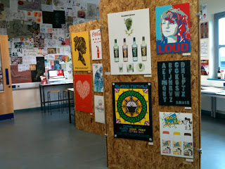
The below images show the collage wall that Laura, Lexie, Aimee and I did before to get the show ready for viewing. Unfortunately we only had cheap blue tac to hold the pieces up so when the other class came in the following day, the majority of the work had fallen down. This meant that they completely re did the wall.
Monday, 27 June 2011
The Show
The Show
This post shows images of the show when it is up and running. I took these photos when the show room was quiet so that the work could be seen properly. Before all the work was up I wasn't sure about the cork background however once the work was put up I thought it looked so much better and more modern.
I personally think that the show was a success, especially for the first week, the VIP viewing in particular. Unfortunately the second week of the show appeared to be a lot quieter to the first week.

 |
| The wall collage of every bodies work |
 |
| This laptop shows all the students websites |
 | ||||
| This laptop (middle laptop) shows a slideshow of photographs collected over the 2 years |
The Show
The picture below show the pieces of my work that have been put up in the show.
I have had all three of my Narrative Images printed A3, My Sheppard Fairey design has been printed A2, and my Christmas Card and Retro Poster have both been printed to A3.
I am pleased with how my work looks in the show and with the sizes that it was printed to. My narrative images look a lot darker printed on the glossy paper. My family and friends were also pleased with all my work and were also amazed by the standard of everyone's work when they viewed the pieces at the VIP evening.
I have had all three of my Narrative Images printed A3, My Sheppard Fairey design has been printed A2, and my Christmas Card and Retro Poster have both been printed to A3.
 |
| This is my three narrative images printed at A3 each. |
 |
| This is my Rimmel Retro poster printed at A3. |
 |
| This is my Sheppard Fairey style poster printed at A2. |
 |
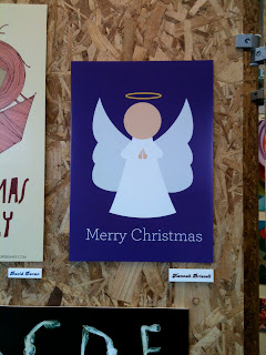
| This is my Christmas Card printed at A3. |
Monday, 6 June 2011
Working for the show
I am currently working up pieces for the Show which is open in just over a weeks time. My narrative project Wolf and Little Red Riding Hood posters have been printed and my Grandma one has now been given to Babs ready for print.
I have still got my hand drawn poster to work up for the show. After looking at the design in Illustrator I have decided that it needs to relate more to hands and that it is quite pixilated as well as confusing to use where it is a live paint document. Therefore I will spend part of tomorrow working up an improved design by hand which I will then scan into the computer to colour up. This design will include more letters and drawings of fingers.
I have also got my FMP designs to work up for the show as I feel they would look better if improved. I want to add type above the models heads with post-it notes or just written by hand to see if this will work better than the ripped paper for this.
Today Lexie and I moved the large boards in the centre of the show room and got rid of three of the attached ones as they were taking up too much room. This didn't take as long as I expected it to take and was actually a lot easier than I expected.
Monday, 23 May 2011
FMP Final Designs
These are my final design posters that I have created so far. I am quite happy with the outcomes of these and how they link well together. I like how each poster looks like the models are enjoying themselves, however I would like to change them into a more grunge style to see if this works better:
Although I have completed a poster for each issue, I would now like to develop these designs into a more grunge style with inspiration from David Carson and Shepard Fairey. I have also taken inspiration from the Inbetweeners opening video. This video made me think of David Carson's and Shepard Fairey's style of working together.
I am hoping that there is enough time left for me to produce my posters in a similar style as this could make the poster more eye catching.
Monday, 21 March 2011
FMP review on progress so far
I am now over two thirds of the way through my research for this project. I have researched into:
- Alcohol Abuse
- Drug Abuse
- Safe sex
- Smoking
- Salvador Dali
- David Hockney
- Photography styles
- Photo montage
- Photo journalism
- Health and safety issues
- NHS history
- History of posters
- Abstract and literal advertising
- 10 ads that changed advertising
- I have also been on a trip to London to gather primary research and to visit the Tate Modern
In order to research into image manipulation techniques I will need to have produced thumbnail ideas with a rough idea of what I want to achieve in my final posters. Therefore I wont be able to research into this until later in my project. I currently still need to research into:
- Well known adverts
- Adverts I like and dislike
- Photographers I like and may use their style
- Pablo Picasso
- Printing methods
- Create moodboards
- Create questionnaires to give to peers and to take to hospital on a visit to gain primary research
Sunday, 20 March 2011
Job possibilities
Junior Designer job :
http://www.creativepool.co.uk/employee/RAM/EN70946/JN1342420/JUNIOR-DIGITAL-CREATIVE-DESIGNER-for-NET-A-PORTER-job-Central-London.php
Digital retoucher job:
http://www.venturephotography.com:80/uk/studios/chichester/careers/digital-re-toucher/?jobtype=studio
Exhibition representative job:
http://www.venturephotography.com:80/uk/studios/canterbury/careers/sales-representative/?jobtype=studio
Possible job for Barclay's Bank
This is a scheme that Barclay's have in place for school/college leavers so will suit me.
The web address is: http://www.barclaysdegree.com/
Pathmotion.com
I found this website that can help me choose my next step when it comes to jobs. I had to answer several questions about myself, select from a list of area that I may be interested in and enter my current qualification that I am studying. Below I will show screen shots of my results from these different parts:
The first two screen shots show my results from the several questions that I answered...
The first two screen shots show my results from the several questions that I answered...
The next screen grabs show the job suggestions which this website developed from my above results, my area preferences and my current qualification I am studying. They are in the order that the website suggested.
Monday, 14 March 2011
FMP brief
I have decided to base my final major project on a health campaign aimed at teenagers. This felt the most appropriate idea seeing as I am a teenager myself and have my own views on these issues as well as being surrounded by teenagers every day. This will allow me to gather market research far more easily. I also have two hospitals local to me where I will be able to collect market research from too.
I will need to research into:
I will need to research into:
- Drug abuse
- Alcohol abuse
- Smoking
- Safe sex
- Existing campaigns on these issues
- History of posters
- Well known adverts
- Adverts I like
- Adverts I dislike
- NHS History
- produce questionnaires for market research
- Visit museums
- Artists- especially surreal artists as I am thinking about going along this theme
- Photographers
- Image manipulation techniques
- Photo journalism
- Photo montage
- Different photography style
- Printing methods
- Anatomy of type
- Create moodboards
Initial Ideas for Final Major Project
For my final major project I know that I want to produce my final designs using photography. I came up with the following ideas for my project, knowing that I wanted to show these using photography. I chose to use photography as I feel this is where my talent is, especially in the image manipulation side of things.
- Wedding- beautiful dresses contrasted by dreadful scenery
- Health campaign for teenagers- smoking, alcohol, safe sex and drugs
- Smoking campaign- aimed at parents- will have images of children with smoke trailing after them. i.e boy playing football with smoke coming off foot once kicked ball, girl with fairy wand- smoke trailing after wand
- Keep fit campaign- various dance- glowing effect to show it makes you feel good
- Natural beauty (beauty vs fake)- nature combined with people(make-up/natural)
Monday, 28 February 2011
Final Outcomes-Narrative Image
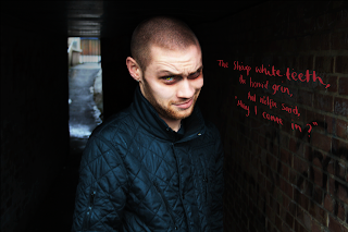
This post shows my three final outcomes for my Narrative Image making project. The first is of the 'wolfie' character, the second is of the 'glam-ma-ma' character and the third is of the little red riding hood character.
I am really pleased with the outcomes of these images. I have managed to create the sinister feel that I wanted to achieve.

Tuesday, 15 February 2011
Image manipulation inspiration for FMP
I found these images when looking for inspiration for my FMP. I know that I want to base my project on photography and image manipulation. I have gained various ideas from some of these images as to what theme I can base the project on and how I can achieve these.
Subscribe to:
Comments (Atom)


